


Alte Karte der Tornadoaktivität in den USA 1930-1974 von Fujita & Pearson: Pfade, Todesstatistiken, Tornado Alley
20% Rabatt auf 2 — 33% Rabatt auf 3
Fügen Sie beliebige zwei berechtigte Artikel zu Ihrem Warenkorb hinzu, um 20% Rabatt zu erhalten. Fügen Sie einen dritten hinzu und er ist kostenlos (entspricht 33% Rabatt, wenn Sie drei kaufen).
Kein Code erforderlich — das Angebot wird automatisch an der Kasse angewendet.
Gültig für alle Standardkarten und Kunstdrucke. Sie können beliebige Designs kombinieren.
Wenn Sie Artikel an mehrere Adressen versenden möchten, kontaktieren Sie uns bitte, bevor Sie Ihre Bestellung aufgeben.
Maßanfertigungen und individuelle Aufträge sind ausgeschlossen.
Kontaktieren Sie uns wenn Sie Fragen haben
 In London gestaltet Hergestellt in Canada
In London gestaltet • Hergestellt in Canada
In London gestaltet Hergestellt in Canada
In London gestaltet • Hergestellt in Canada

Aus der Originalkarte von 1974 restauriert und in Museumsqualität gedruckt. Vollständige Beschreibung unten.
Choose your size
Choose your finish


(Mehr Infos)
Geschenkmitteilung & individuelle Ausführung

Wenn Sie eine Geschenkmitteilung oder eine Ausführung (Puzzle, Aluminiumplatte usw.) hinzufügen möchten, die hier nicht verfügbar ist, geben Sie dies bitte in der "Bestellnotiz" beim Checkout an.
Jede Bestellung wird individuell angefertigt. Wenn Sie die Größe leicht anpassen oder auf einem ungewöhnlichen Material drucken lassen möchten, lassen Sie es uns einfach wissen. Wir haben im Laufe der Jahre Tausende von individuellen Bestellungen bearbeitet, daher gibt es (fast) nichts, was wir nicht bewältigen können.
Sie können uns auch kontaktieren, bevor Sie bestellen, wenn Sie möchten!

- Lokal gefertigt. Sicher geliefert
- Keine Zölle oder versteckten Gebühren
- Hilfe nötig? Rufen Sie uns an oder WhatsApp schreiben
Own a piece of history
8,000+ five-star reviews


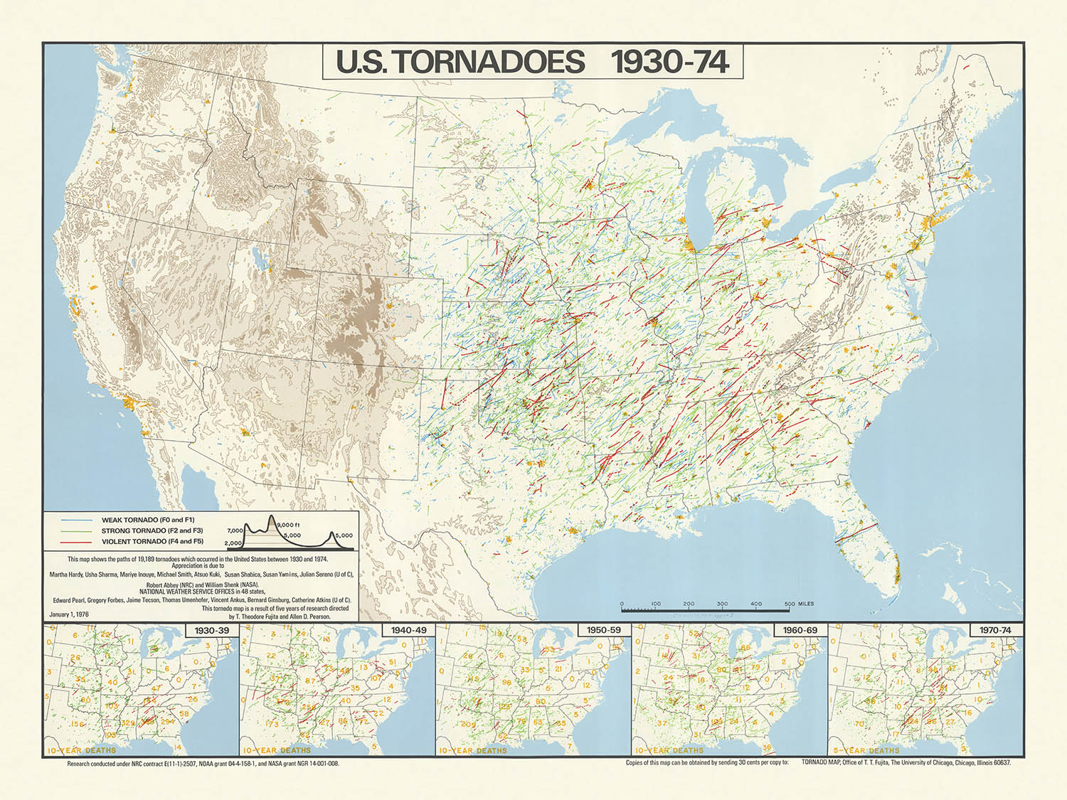
Im Herzen dieser Karte liegt eine meisterhafte Verwendung von Infografik-Techniken. Jeder Tornadopfad ist sorgfältig nachgezeichnet, was zu einer dramatischen Konzentration von Linien...
Read the full product descriptionIm Herzen dieser Karte liegt eine meisterhafte Verwendung von Infografik-Techniken. Jeder Tornadopfad ist sorgfältig nachgezeichnet, was zu einer dramatischen Konzentration von Linien führt, die sofort das Auge auf das berüchtigte "Tornado Alley" im zentralen Teil der Vereinigten Staaten lenkt. Das Design der Karte balanciert elegant Klarheit und Dichte, indem es subtile Hintergrundmerkmale wie Staatsgrenzen, große Flüsse und die Großen Seen nutzt, um Orientierung zu bieten, ohne von den zentralen Daten abzulenken. Dieser Ansatz spiegelt die besten Traditionen der wissenschaftlichen Kartografie der 1970er Jahre wider, in denen Funktion und Form harmonisch miteinander verwoben sind.
Was diese Karte wirklich erhöht, ist ihre Integration statistischer Einsätze, die tornado-bedingte Todesfälle nach Jahrzehnten von 1930 bis 1974 aufzeichnen. Diese fünf Inset-Karten bieten einen ernüchternden Kontrapunkt zu den wirbelnden Tornadopfade und kontextualisieren die menschlichen Kosten dieser Naturkatastrophen. Die Einbeziehung dieser Infografiken verwandelt die Karte von einem bloßen Protokoll meteorologischer Ereignisse in eine nuancierte Erkundung von Risiko, Widerstandsfähigkeit und der Entwicklung der öffentlichen Sicherheit angesichts der Unberechenbarkeit der Natur.
Die Schöpfer der Karte, T. Theodore Fujita und Allen D. Pearson, sind legendäre Persönlichkeiten im Bereich der Forschung zu extremen Wetterereignissen. Fujita ist insbesondere bekannt für die Entwicklung der Fujita-Skala, die nach wie vor ein grundlegendes Werkzeug zur Bewertung der Tornadointensität darstellt. Ihre Zusammenarbeit an dieser Karte verleiht ihr nicht nur wissenschaftliche Autorität, sondern markiert auch einen entscheidenden Moment in der Geschichte der Meteorologie, als Forscher begannen, visuelle Daten zu nutzen, um komplexe Muster zu kommunizieren und das öffentliche Verständnis zu fördern.
Über ihren unmittelbaren wissenschaftlichen Wert hinaus steht diese Karte als kulturelles und historisches Artefakt. Sie fängt eine Transformationsphase in der amerikanischen Meteorologie ein, als Fortschritte in der Datenerhebung und -analyse neue Einblicke in die Muster extremer Wetterereignisse ermöglichten. Für Sammler, Historiker und Wetterenthusiasten bietet diese Karte sowohl einen Schnappschuss einer prägenden Ära als auch ein Zeugnis für die anhaltende Kraft der Kartografie, die Kräfte zu beleuchten, die unsere Welt formen.
Orte auf dieser Karte
- Vereinigte Staaten von Amerika (zusammenhängende 48 Bundesstaaten)
- Texas
- Oklahoma
- Kansas
- Nebraska
- Iowa
- Missouri
- Arkansas
- Illinois
- Indiana
- Ohio
- Mississippi River
- Große Seen (Oberer See, Michigansee, Huronsee, Eriesee, Ontariosee)
- Appalachen
- Südoststaaten (z.B. Alabama, Mississippi, Georgia, Tennessee)
- Zentralebene (Tornado Alley)
- Westliche Vereinigte Staaten (weniger Tornadoaktivität)
- Nordöstliche Vereinigte Staaten (weniger Tornadoaktivität)
- Staatsgrenzen (alle zusammenhängenden US-Bundesstaaten)
- US-regionale Divisionen (Midwest, Süden, Ebenen, Südosten)
- Grenzen zu Kanada und Mexiko
- Golf von Mexiko (südliche Grenze)
- Atlantischer Ozean (östliche Grenze)
- Pazifischer Ozean (westliche Grenze, obwohl nicht der Fokus)
- Einlegekarten, die die gesamten USA für Todesstatistiken nach Jahrzehnten zeigen
Bemerkenswerte Merkmale & Wahrzeichen
- Dichte Cluster von Tornadopfade, insbesondere in den zentralen Vereinigten Staaten (Tornado Alley)
- Deutlich markierte Tornadopfade, die jeweils ein individuelles Tornadoereignis repräsentieren
- Fünf Einlegekarten, die jeweils tornado-bedingte Todesfälle nach Jahrzehnten (1930-39, 1940-49, 1950-59, 1960-69, 1970-74) darstellen
- Wichtige Flüsse, wie der Mississippi, werden dargestellt, um die geografische Orientierung zu unterstützen
- Die Großen Seen werden als wichtige Gewässer dargestellt
- Die Appalachen sind sichtbar und dienen als geografischer Referenzpunkt
- Die Kartenlegende erklärt die Symbole und Linien, die für Tornadopfade und Todesstatistiken verwendet werden
- Der Kartentitel und die Credits an T. Theodore Fujita und Allen D. Pearson sind deutlich sichtbar
- Die höchste Dichte von Tornadopfade erscheint in Staaten wie Texas, Oklahoma, Kansas, Nebraska und Iowa
- Niedrigere Dichte von Tornadopfade in den westlichen und nordöstlichen Vereinigten Staaten
- Der Südosten der USA zeigt ebenfalls eine bemerkenswerte Anzahl von Tornadopfade
- Die Einlegekarten verwenden Schattierungen oder Punkte, um die Anzahl der tornado-bedingten Todesfälle pro Staat oder Region darzustellen
- Die Karte verwendet kontrastierende Farben oder Liniengewichte, um Tornadopfade von anderen Merkmalen zu unterscheiden
- Das Gesamtdesign ist datendicht und betont die Häufigkeit und Verteilung von Tornados
- Die Karte enthält eine Maßstabsleiste zur Referenz
- Tornadopfade kreuzen manchmal Staatsgrenzen und veranschaulichen die weitreichende Natur mancher Tornados
- Die Karte ist so orientiert, dass Norden oben ist, entsprechend den standardmäßigen kartografischen Konventionen
Historischer und gestalterischer Kontext
- Name der Karte: U.S. Tornados, 1930-74
- Erstellt von T. Theodore Fujita und Allen D. Pearson im Jahr 1974
- Thematische Infografik-Karte, die sich auf Tornado-Ereignisse in den Vereinigten Staaten konzentriert
- Visualisiert die Pfade von 19.189 Tornados, die zwischen 1930 und 1974 in den USA auftraten
- Beinhaltet Einlegekarten, die tornado-bedingte Todesfälle für fünf verschiedene Jahrzehnte zeigen: 1930-39, 1940-49, 1950-59, 1960-69 und 1970-74
- Der Maßstab der Karte beträgt ungefähr 1:6.000.000
- Kartenmacher: T. Theodore Fujita, ein Pionier der Meteorologie, bekannt für die Entwicklung der Fujita-Skala (F-Skala) zur Tornadointensität, und Allen D. Pearson, eine bemerkenswerte Figur in der Forschung zu extremen Wetterereignissen
- Veröffentlicht im Jahr 1974, kurz nach dem verheerenden Super Outbreak von 1974, einem der größten Tornadoausbrüche in der Geschichte der USA
- Die Karte ist ein Produkt einer Zeit, in der die Dokumentation und Forschung zu Tornados systematischer wurden, mit zunehmender Nutzung meteorologischer Daten
- Sie bietet eine einzigartige visuelle Zusammenfassung von über vier Jahrzehnten Tornadoaktivität und betont die Häufigkeit und Verteilung von Tornadopfade
- Thematisch behandelt die Karte Naturgefahren, insbesondere Tornados, und deren Auswirkungen auf das menschliche Leben
- Die Einlegekarten geben wertvollen historischen Kontext zu den sich verändernden Mustern der tornado-bedingten Todesfälle im Laufe der Zeit
- Die Karte diente wahrscheinlich als Forschungsinstrument und Informationsressource für die Öffentlichkeit in einer Zeit zunehmenden Interesses an Katastrophenvorsorge
- Das Design verwendet dichte, sich überlappende Linien, um Tornadopfade darzustellen und vermittelt visuell die Konzentration der Tornadoaktivität in bestimmten Regionen
- Hebt die Region "Tornado Alley" in den zentralen USA hervor, die für ihre hohe Tornadofrequenz bekannt ist
- Spiegelt den Stand der meteorologischen Wissenschaft und Datensammlung in der Mitte des 20. Jahrhunderts wider
- Die Erstellung der Karte spiegelt eine wachsende Zusammenarbeit zwischen Meteorologen und Kartografen zur öffentlichen Kommunikation wider
- Historische Bedeutung: stellt eine der frühesten umfassenden Visualisierungen von Tornadodaten in den USA dar
- Der Datenzeitraum (1930-1974) umfasst bedeutende technologische und methodische Fortschritte in der Wetterbeobachtung
- Die Karte bietet eine Basislinie zum Vergleich der Tornadoaktivität vor und nach der Einführung moderner Warnsysteme
- Sie dient als historisches Dokument, das die Entwicklung sowohl der Tornadoforschung als auch der Bemühungen um öffentliche Sicherheit zeigt
- Die Karte hätte zum öffentlichen Verständnis der Tornadorisiken beigetragen und die Politik sowie Bauvorschriften in tornadoanfälligen Gebieten beeinflusst
- Der Stil der Karte ist charakteristisch für die Infografiken der 1970er Jahre, mit einem Fokus auf Klarheit und dichte Datenvisualisierung
- Die Einbeziehung von Todesstatistiken kontextualisiert die menschlichen Kosten von Tornados, nicht nur deren Häufigkeit
- Die Karte ist ein frühes Beispiel für thematische Kartierung in der Meteorologie, die der weit verbreiteten Einführung von GIS vorausgeht
- Die Veröffentlichung der Karte durch führende Tornadoforscher verleiht ihr zusätzliche wissenschaftliche Glaubwürdigkeit
- Der Infografikansatz macht komplexe meteorologische Daten einem breiteren Publikum zugänglich
- Der Fokus der Karte auf die USA spiegelt die einzigartige Verwundbarkeit des Landes gegenüber Tornados aufgrund von Geographie und Klima wider
- Die Karte enthält nicht Alaska, Hawaii oder US-Territorien, sondern konzentriert sich ausschließlich auf die zusammenhängenden Staaten
Bitte überprüfen Sie die Bilder, um sicherzustellen, dass eine bestimmte Stadt oder ein bestimmter Ort auf dieser Karte angezeigt wird. Sie können uns auch kontaktieren und bitten, die Karte für Sie zu überprüfen.
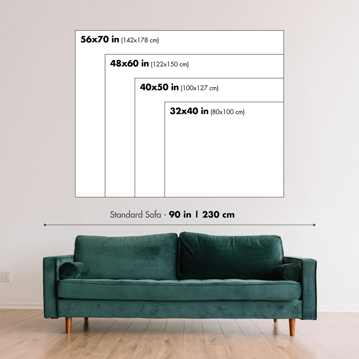
Diese Karte sieht in jeder Größe großartig aus, aber ich empfehle immer, eine größere Größe zu wählen, wenn Sie Platz haben. So können Sie alle Details leicht erkennen.
Diese Karte sieht in Größen bis zu 90 Zoll (230 cm) fantastisch aus. Wenn Sie nach einer größeren Karte suchen, bitte kontaktieren Sie uns.
Das Modell in den Angebotsbildern hält die 18x24 Zoll (45x60 cm) Version dieser Karte.
Das fünfte Angebotsbild zeigt ein Beispiel für meinen Personalisierungsservice für Karten.
Wenn Sie nach etwas leicht anderem suchen, schauen Sie sich meine Sammlung der besten alten Karten an, um zu sehen, ob etwas anderes Ihr Interesse weckt.
Bitte kontaktieren Sie mich, um zu überprüfen, ob ein bestimmter Standort, ein Wahrzeichen oder ein Merkmal auf dieser Karte angezeigt wird.
Dies wäre ein wunderbares Geburtstags-, Weihnachts-, Vatertags-, Abschied-, Jubiläums- oder Einweihungsgeschenk für jemanden aus den von dieser Karte abgedeckten Gebieten.
Diese Karte ist als Giclée-Druck auf säurefreiem, archiviertem mattem Papier erhältlich, oder Sie können sie gerahmt kaufen. Der Rahmen ist ein schöner, einfacher schwarzer Rahmen, der zu den meisten Ästhetiken passt. Bitte kontaktieren Sie uns, wenn Sie eine andere Rahmenfarbe oder -material wünschen. Meine Rahmen sind mit superklarem, museumsgradigem Acryl (Plexiglas/AcryLite) verglast, das erheblich weniger reflektierend als Glas ist, sicherer und immer in perfektem Zustand ankommt.
This map is also available as a float framed canvas, sometimes known as a shadow gap framed canvas or canvas floater. The map is printed on artist's cotton canvas and then stretched over a handmade box frame. We then "float" the canvas inside a wooden frame, which is available in a range of colours (black, dark brown, oak, antique gold and white). This is a wonderful way to present a map without glazing in front. See some examples of float framed canvas maps and explore the differences between my different finishes.
For something truly unique, this map is also available in "Unique 3D", our trademarked process that dramatically transforms the map so that it has a wonderful sense of depth. We combine the original map with detailed topography and elevation data, so that mountains and the terrain really "pop". For more info and examples of 3D maps, check my Unique 3D page.
Im Herzen dieser Karte liegt eine meisterhafte Verwendung von Infografik-Techniken. Jeder Tornadopfad ist sorgfältig nachgezeichnet, was zu einer dramatischen Konzentration von Linien führt, die sofort das Auge auf das berüchtigte "Tornado Alley" im zentralen Teil der Vereinigten Staaten lenkt. Das Design der Karte balanciert elegant Klarheit und Dichte, indem es subtile Hintergrundmerkmale wie Staatsgrenzen, große Flüsse und die Großen Seen nutzt, um Orientierung zu bieten, ohne von den zentralen Daten abzulenken. Dieser Ansatz spiegelt die besten Traditionen der wissenschaftlichen Kartografie der 1970er Jahre wider, in denen Funktion und Form harmonisch miteinander verwoben sind.
Was diese Karte wirklich erhöht, ist ihre Integration statistischer Einsätze, die tornado-bedingte Todesfälle nach Jahrzehnten von 1930 bis 1974 aufzeichnen. Diese fünf Inset-Karten bieten einen ernüchternden Kontrapunkt zu den wirbelnden Tornadopfade und kontextualisieren die menschlichen Kosten dieser Naturkatastrophen. Die Einbeziehung dieser Infografiken verwandelt die Karte von einem bloßen Protokoll meteorologischer Ereignisse in eine nuancierte Erkundung von Risiko, Widerstandsfähigkeit und der Entwicklung der öffentlichen Sicherheit angesichts der Unberechenbarkeit der Natur.
Die Schöpfer der Karte, T. Theodore Fujita und Allen D. Pearson, sind legendäre Persönlichkeiten im Bereich der Forschung zu extremen Wetterereignissen. Fujita ist insbesondere bekannt für die Entwicklung der Fujita-Skala, die nach wie vor ein grundlegendes Werkzeug zur Bewertung der Tornadointensität darstellt. Ihre Zusammenarbeit an dieser Karte verleiht ihr nicht nur wissenschaftliche Autorität, sondern markiert auch einen entscheidenden Moment in der Geschichte der Meteorologie, als Forscher begannen, visuelle Daten zu nutzen, um komplexe Muster zu kommunizieren und das öffentliche Verständnis zu fördern.
Über ihren unmittelbaren wissenschaftlichen Wert hinaus steht diese Karte als kulturelles und historisches Artefakt. Sie fängt eine Transformationsphase in der amerikanischen Meteorologie ein, als Fortschritte in der Datenerhebung und -analyse neue Einblicke in die Muster extremer Wetterereignisse ermöglichten. Für Sammler, Historiker und Wetterenthusiasten bietet diese Karte sowohl einen Schnappschuss einer prägenden Ära als auch ein Zeugnis für die anhaltende Kraft der Kartografie, die Kräfte zu beleuchten, die unsere Welt formen.
Orte auf dieser Karte
- Vereinigte Staaten von Amerika (zusammenhängende 48 Bundesstaaten)
- Texas
- Oklahoma
- Kansas
- Nebraska
- Iowa
- Missouri
- Arkansas
- Illinois
- Indiana
- Ohio
- Mississippi River
- Große Seen (Oberer See, Michigansee, Huronsee, Eriesee, Ontariosee)
- Appalachen
- Südoststaaten (z.B. Alabama, Mississippi, Georgia, Tennessee)
- Zentralebene (Tornado Alley)
- Westliche Vereinigte Staaten (weniger Tornadoaktivität)
- Nordöstliche Vereinigte Staaten (weniger Tornadoaktivität)
- Staatsgrenzen (alle zusammenhängenden US-Bundesstaaten)
- US-regionale Divisionen (Midwest, Süden, Ebenen, Südosten)
- Grenzen zu Kanada und Mexiko
- Golf von Mexiko (südliche Grenze)
- Atlantischer Ozean (östliche Grenze)
- Pazifischer Ozean (westliche Grenze, obwohl nicht der Fokus)
- Einlegekarten, die die gesamten USA für Todesstatistiken nach Jahrzehnten zeigen
Bemerkenswerte Merkmale & Wahrzeichen
- Dichte Cluster von Tornadopfade, insbesondere in den zentralen Vereinigten Staaten (Tornado Alley)
- Deutlich markierte Tornadopfade, die jeweils ein individuelles Tornadoereignis repräsentieren
- Fünf Einlegekarten, die jeweils tornado-bedingte Todesfälle nach Jahrzehnten (1930-39, 1940-49, 1950-59, 1960-69, 1970-74) darstellen
- Wichtige Flüsse, wie der Mississippi, werden dargestellt, um die geografische Orientierung zu unterstützen
- Die Großen Seen werden als wichtige Gewässer dargestellt
- Die Appalachen sind sichtbar und dienen als geografischer Referenzpunkt
- Die Kartenlegende erklärt die Symbole und Linien, die für Tornadopfade und Todesstatistiken verwendet werden
- Der Kartentitel und die Credits an T. Theodore Fujita und Allen D. Pearson sind deutlich sichtbar
- Die höchste Dichte von Tornadopfade erscheint in Staaten wie Texas, Oklahoma, Kansas, Nebraska und Iowa
- Niedrigere Dichte von Tornadopfade in den westlichen und nordöstlichen Vereinigten Staaten
- Der Südosten der USA zeigt ebenfalls eine bemerkenswerte Anzahl von Tornadopfade
- Die Einlegekarten verwenden Schattierungen oder Punkte, um die Anzahl der tornado-bedingten Todesfälle pro Staat oder Region darzustellen
- Die Karte verwendet kontrastierende Farben oder Liniengewichte, um Tornadopfade von anderen Merkmalen zu unterscheiden
- Das Gesamtdesign ist datendicht und betont die Häufigkeit und Verteilung von Tornados
- Die Karte enthält eine Maßstabsleiste zur Referenz
- Tornadopfade kreuzen manchmal Staatsgrenzen und veranschaulichen die weitreichende Natur mancher Tornados
- Die Karte ist so orientiert, dass Norden oben ist, entsprechend den standardmäßigen kartografischen Konventionen
Historischer und gestalterischer Kontext
- Name der Karte: U.S. Tornados, 1930-74
- Erstellt von T. Theodore Fujita und Allen D. Pearson im Jahr 1974
- Thematische Infografik-Karte, die sich auf Tornado-Ereignisse in den Vereinigten Staaten konzentriert
- Visualisiert die Pfade von 19.189 Tornados, die zwischen 1930 und 1974 in den USA auftraten
- Beinhaltet Einlegekarten, die tornado-bedingte Todesfälle für fünf verschiedene Jahrzehnte zeigen: 1930-39, 1940-49, 1950-59, 1960-69 und 1970-74
- Der Maßstab der Karte beträgt ungefähr 1:6.000.000
- Kartenmacher: T. Theodore Fujita, ein Pionier der Meteorologie, bekannt für die Entwicklung der Fujita-Skala (F-Skala) zur Tornadointensität, und Allen D. Pearson, eine bemerkenswerte Figur in der Forschung zu extremen Wetterereignissen
- Veröffentlicht im Jahr 1974, kurz nach dem verheerenden Super Outbreak von 1974, einem der größten Tornadoausbrüche in der Geschichte der USA
- Die Karte ist ein Produkt einer Zeit, in der die Dokumentation und Forschung zu Tornados systematischer wurden, mit zunehmender Nutzung meteorologischer Daten
- Sie bietet eine einzigartige visuelle Zusammenfassung von über vier Jahrzehnten Tornadoaktivität und betont die Häufigkeit und Verteilung von Tornadopfade
- Thematisch behandelt die Karte Naturgefahren, insbesondere Tornados, und deren Auswirkungen auf das menschliche Leben
- Die Einlegekarten geben wertvollen historischen Kontext zu den sich verändernden Mustern der tornado-bedingten Todesfälle im Laufe der Zeit
- Die Karte diente wahrscheinlich als Forschungsinstrument und Informationsressource für die Öffentlichkeit in einer Zeit zunehmenden Interesses an Katastrophenvorsorge
- Das Design verwendet dichte, sich überlappende Linien, um Tornadopfade darzustellen und vermittelt visuell die Konzentration der Tornadoaktivität in bestimmten Regionen
- Hebt die Region "Tornado Alley" in den zentralen USA hervor, die für ihre hohe Tornadofrequenz bekannt ist
- Spiegelt den Stand der meteorologischen Wissenschaft und Datensammlung in der Mitte des 20. Jahrhunderts wider
- Die Erstellung der Karte spiegelt eine wachsende Zusammenarbeit zwischen Meteorologen und Kartografen zur öffentlichen Kommunikation wider
- Historische Bedeutung: stellt eine der frühesten umfassenden Visualisierungen von Tornadodaten in den USA dar
- Der Datenzeitraum (1930-1974) umfasst bedeutende technologische und methodische Fortschritte in der Wetterbeobachtung
- Die Karte bietet eine Basislinie zum Vergleich der Tornadoaktivität vor und nach der Einführung moderner Warnsysteme
- Sie dient als historisches Dokument, das die Entwicklung sowohl der Tornadoforschung als auch der Bemühungen um öffentliche Sicherheit zeigt
- Die Karte hätte zum öffentlichen Verständnis der Tornadorisiken beigetragen und die Politik sowie Bauvorschriften in tornadoanfälligen Gebieten beeinflusst
- Der Stil der Karte ist charakteristisch für die Infografiken der 1970er Jahre, mit einem Fokus auf Klarheit und dichte Datenvisualisierung
- Die Einbeziehung von Todesstatistiken kontextualisiert die menschlichen Kosten von Tornados, nicht nur deren Häufigkeit
- Die Karte ist ein frühes Beispiel für thematische Kartierung in der Meteorologie, die der weit verbreiteten Einführung von GIS vorausgeht
- Die Veröffentlichung der Karte durch führende Tornadoforscher verleiht ihr zusätzliche wissenschaftliche Glaubwürdigkeit
- Der Infografikansatz macht komplexe meteorologische Daten einem breiteren Publikum zugänglich
- Der Fokus der Karte auf die USA spiegelt die einzigartige Verwundbarkeit des Landes gegenüber Tornados aufgrund von Geographie und Klima wider
- Die Karte enthält nicht Alaska, Hawaii oder US-Territorien, sondern konzentriert sich ausschließlich auf die zusammenhängenden Staaten
Bitte überprüfen Sie die Bilder, um sicherzustellen, dass eine bestimmte Stadt oder ein bestimmter Ort auf dieser Karte angezeigt wird. Sie können uns auch kontaktieren und bitten, die Karte für Sie zu überprüfen.
Diese Karte sieht in jeder Größe großartig aus, aber ich empfehle immer, eine größere Größe zu wählen, wenn Sie Platz haben. So können Sie alle Details leicht erkennen.
Diese Karte sieht in Größen bis zu 90 Zoll (230 cm) fantastisch aus. Wenn Sie nach einer größeren Karte suchen, bitte kontaktieren Sie uns.
Das Modell in den Angebotsbildern hält die 18x24 Zoll (45x60 cm) Version dieser Karte.
Das fünfte Angebotsbild zeigt ein Beispiel für meinen Personalisierungsservice für Karten.
Wenn Sie nach etwas leicht anderem suchen, schauen Sie sich meine Sammlung der besten alten Karten an, um zu sehen, ob etwas anderes Ihr Interesse weckt.
Bitte kontaktieren Sie mich, um zu überprüfen, ob ein bestimmter Standort, ein Wahrzeichen oder ein Merkmal auf dieser Karte angezeigt wird.
Dies wäre ein wunderbares Geburtstags-, Weihnachts-, Vatertags-, Abschied-, Jubiläums- oder Einweihungsgeschenk für jemanden aus den von dieser Karte abgedeckten Gebieten.
Diese Karte ist als Giclée-Druck auf säurefreiem, archiviertem mattem Papier erhältlich, oder Sie können sie gerahmt kaufen. Der Rahmen ist ein schöner, einfacher schwarzer Rahmen, der zu den meisten Ästhetiken passt. Bitte kontaktieren Sie uns, wenn Sie eine andere Rahmenfarbe oder -material wünschen. Meine Rahmen sind mit superklarem, museumsgradigem Acryl (Plexiglas/AcryLite) verglast, das erheblich weniger reflektierend als Glas ist, sicherer und immer in perfektem Zustand ankommt.
This map is also available as a float framed canvas, sometimes known as a shadow gap framed canvas or canvas floater. The map is printed on artist's cotton canvas and then stretched over a handmade box frame. We then "float" the canvas inside a wooden frame, which is available in a range of colours (black, dark brown, oak, antique gold and white). This is a wonderful way to present a map without glazing in front. See some examples of float framed canvas maps and explore the differences between my different finishes.
For something truly unique, this map is also available in "Unique 3D", our trademarked process that dramatically transforms the map so that it has a wonderful sense of depth. We combine the original map with detailed topography and elevation data, so that mountains and the terrain really "pop". For more info and examples of 3D maps, check my Unique 3D page.
Many of our maps and art prints are chosen as thoughtful gifts for homes, offices, studies and meaningful places.
Choose a framed option for the easiest ready-to-hang gift, or choose an unframed print if the recipient may prefer to select their own frame.
We make orders locally in 23 countries around the world, so gifts can often be produced close to the recipient. This helps them arrive faster, travel more safely, and avoid customs or import duty surprises.
- We can deliver directly to the recipient
- Framed pieces arrive ready to hang
- Unframed prints are carefully packed in a strong protective tube
- Almost every order is made locally, for faster, safer gifting
- 90-day returns give the recipient time to decide
If you are not sure what to choose, please contact us. We can help you pick the right map, size, finish or delivery option.
Für die meisten Bestellungen beträgt die Lieferzeit etwa 3 Werktage. Personalisierte und maßgeschneiderte Produkte benötigen länger, da ich die Personalisierung durchführen und sie Ihnen zur Genehmigung zusenden muss, was normalerweise 1 oder 2 Tage dauert.
Bitte beachten Sie, dass sehr große gerahmte Bestellungen in der Regel länger für die Herstellung und Lieferung benötigen.
Wenn Sie möchten, dass Ihre Bestellung bis zu einem bestimmten Datum ankommt, bitte kontaktieren Sie mich, bevor Sie bestellen, damit wir den besten Weg finden können, um sicherzustellen, dass Sie Ihre Bestellung rechtzeitig erhalten.
Ich drucke und rahme Karten und Kunstwerke in 23 Ländern weltweit. Das bedeutet, dass Ihre Bestellung lokal gefertigt wird, was die Lieferzeit verkürzt und sicherstellt, dass sie während der Lieferung nicht beschädigt wird. Sie zahlen nie Zoll oder Einfuhrgebühren, und wir stoßen weniger CO2 in die Luft aus.
Alle meine Karten und Kunstdrucke sind gut verpackt und werden in einem robusten Rohr versendet, wenn sie ungerahmt sind, oder von Schaum umgeben, wenn sie gerahmt sind.
Ich versuche, alle Bestellungen innerhalb von 1 oder 2 Tagen nach Erhalt Ihrer Bestellung zu versenden, obwohl einige Produkte (wie Gesichtsmasken, Tassen und Tragetaschen) länger zur Herstellung benötigen können.
Wenn Sie Express-Lieferung an der Kasse auswählen, priorisieren wir Ihre Bestellung und versenden sie per 1-Tages-Kurier (Fedex, DHL, UPS, Parcelforce).
Nächster Tag Lieferung ist auch in einigen Ländern verfügbar (USA, UK, Singapur, VAE), aber bitte versuchen Sie, früh am Tag zu bestellen, damit wir es rechtzeitig versenden können.
Lesen Sie meinen vollständigen Leitfaden zur Lieferung und lokalen Produktion
Mein Standardrahmen ist ein Galerie-Stil-Rahmen aus schwarzem Eschenholz. Er ist einfach und sieht ziemlich modern aus. Mein Standardrahmen ist etwa 20 mm (0,8 Zoll) breit.
Ich verwende super-klares Acryl (Plexiglas/Acrylt) für das Glas des Rahmens. Es ist leichter und sicherer als Glas – und es sieht besser aus, da die Reflexion geringer ist.
Sechs Standardrahmenfarben sind kostenlos erhältlich (schwarz, dunkelbraun, dunkelgrau, Eiche, weiß und antikgold).
Die meisten Karten, Kunstwerke und Illustrationen sind auch als gerahmte Leinwand erhältlich. Wir verwenden matte (nicht glänzende) Baumwollleinwand, spannen sie über einen nachhaltig beschafften Buchenrahmen und 'schweben' dann das Stück innerhalb eines Holzrahmens. Das Endergebnis ist ziemlich schön, und es gibt keine Verglasung, die im Weg ist.
Alle Rahmen werden "bereit zum Aufhängen" geliefert, entweder mit einer Schnur oder Halterungen auf der Rückseite. Sehr große Rahmen haben schwere Aufhängeplatten und/oder eine Montageschiene. Wenn Sie Fragen haben, können Sie bitte Kontakt aufnehmen.
Sehen Sie sich einige Beispiele meiner gerahmten Karten und gerahmten Leinwandkarten an.
Alternativ kann ich auch alte Karten und Kunstwerke auf Leinwand, Schaumstoffplatten, Baumwollrag und andere Materialien liefern.
Wenn Sie Ihre Karte oder Ihr Kunstwerk selbst rahmen möchten, lesen Sie bitte zuerst meinen Größenleitfaden.
Meine Karten sind äußerst hochwertige Reproduktionen von Originalkarten.
Ich beziehe originale, seltene Karten aus Bibliotheken, Auktionshäusern und Privatsammlungen auf der ganzen Welt, restauriere sie in meiner Londoner Werkstatt und erstelle dann mit speziellen Giclée-Tinten und -Druckern wunderschöne Karten, die sogar noch besser aussehen als das Original.
Meine Karten werden auf säurefreiem, mattem Archivpapier (nicht glänzend) gedruckt, das sich sehr hochwertig anfühlt und fast wie Karton aussieht. Technisch gesehen beträgt das Papiergewicht/die Papierdicke 10mil/200g/m². Es eignet sich perfekt zum Einrahmen.
Ich drucke mit UV-lichtbeständigen Ultrachrome-Giclée-Pigmenttinten von Epson – einige der besten Tinten, die Sie finden können.
Ich kann auch machen Karten auf Leinwand, Baumwolllappen und andere exotische Materialien.
Erfahren Sie mehr über The Unique Maps Co.
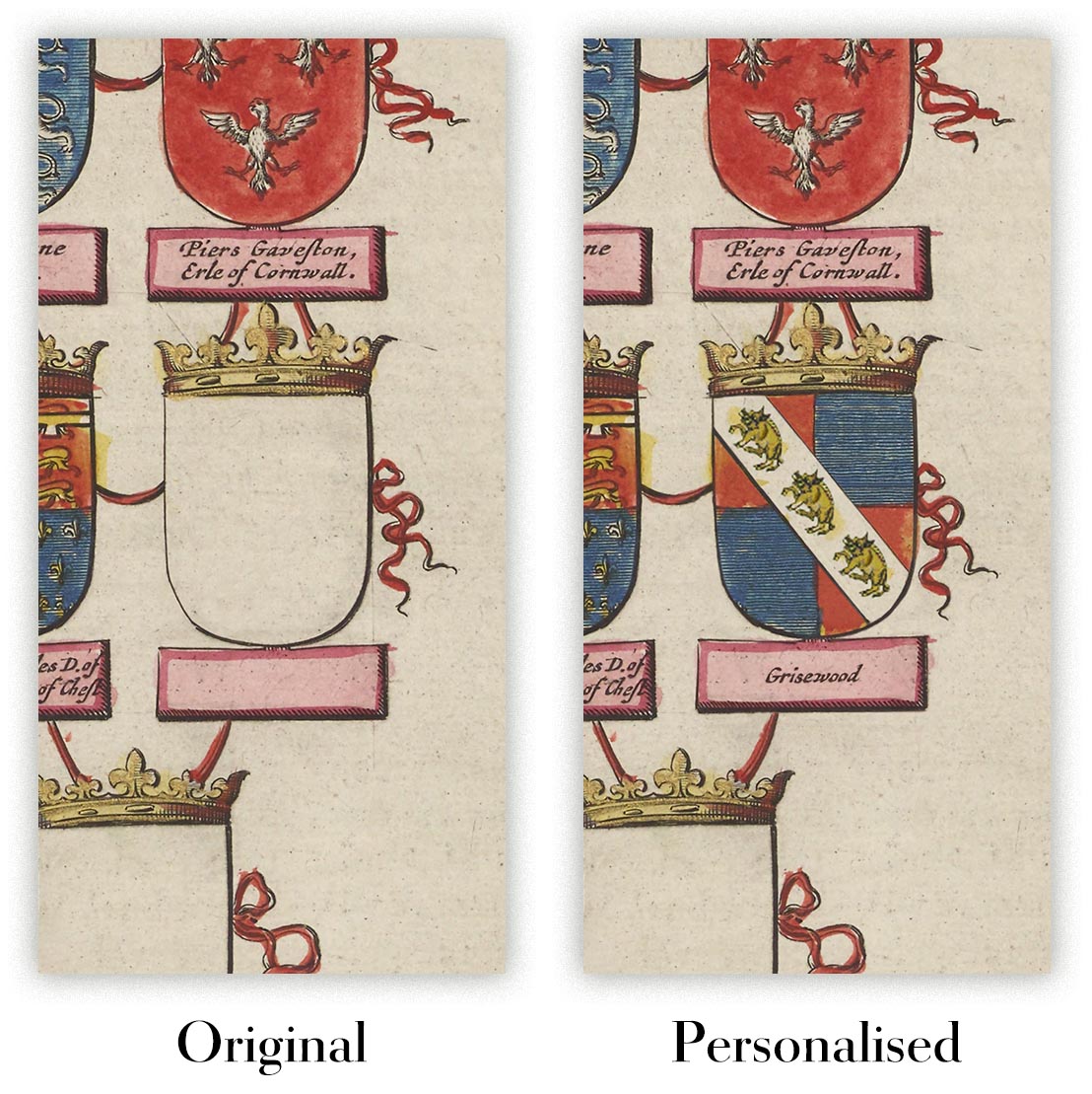
Kartenpersonalisierung
Wenn Sie nach dem perfekten Geschenk zum Jahrestag oder zur Einweihung suchen, kann ich Ihre Karte personalisieren, um sie wirklich einzigartig zu machen. Ich kann beispielsweise eine kurze Nachricht hinzufügen, einen wichtigen Ort hervorheben oder das Wappen Ihrer Familie hinzufügen.
Die Möglichkeiten sind nahezu unbegrenzt. Bitte sehen Sie sich meine Kartenpersonalisierungsseite für einige wunderbare Beispiele dessen, was möglich ist.
Um eine personalisierte Karte zu bestellen, wählen Sie „Personalisieren Sie Ihre Karte“, bevor Sie sie in den Warenkorb legen.
In Kontakt kommen wenn Sie nach komplexeren Anpassungen und Personalisierungen suchen.
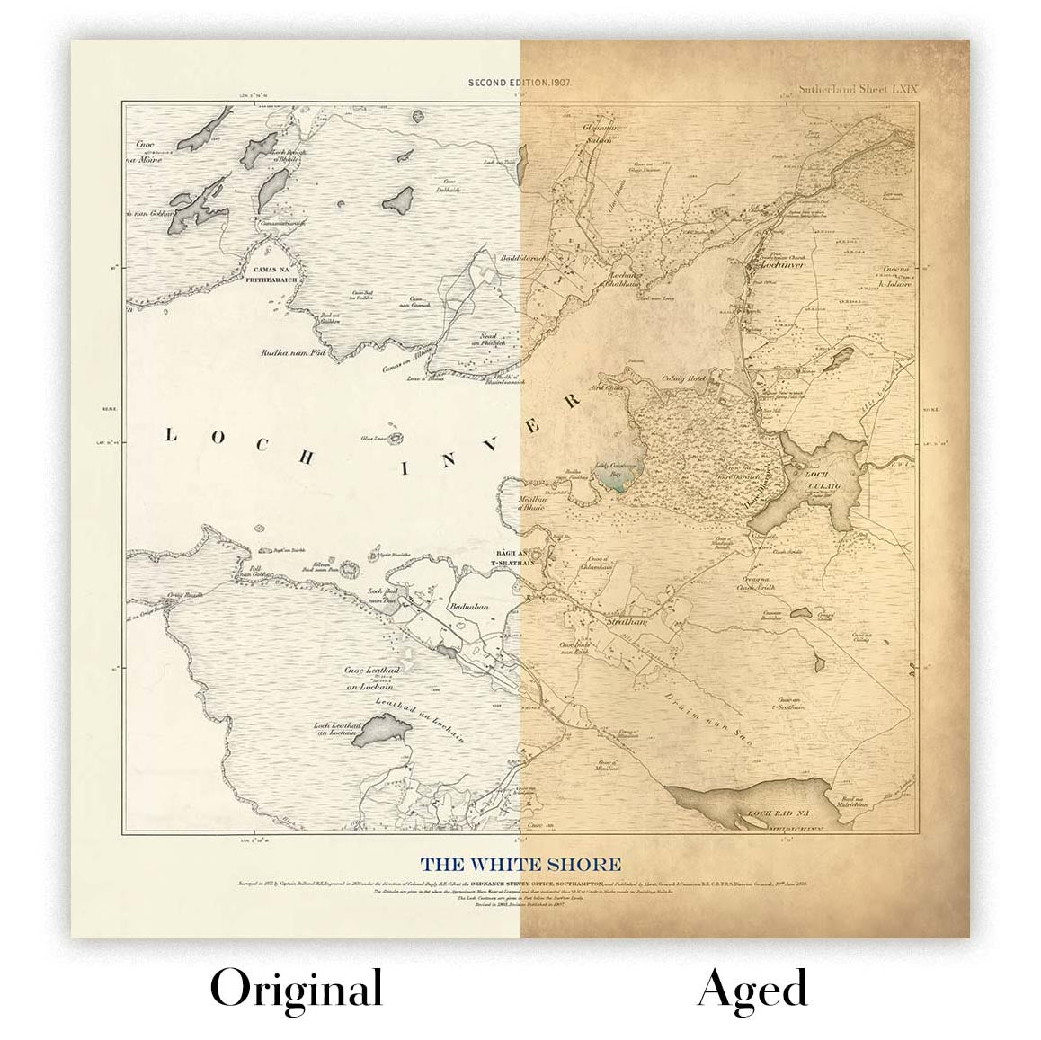
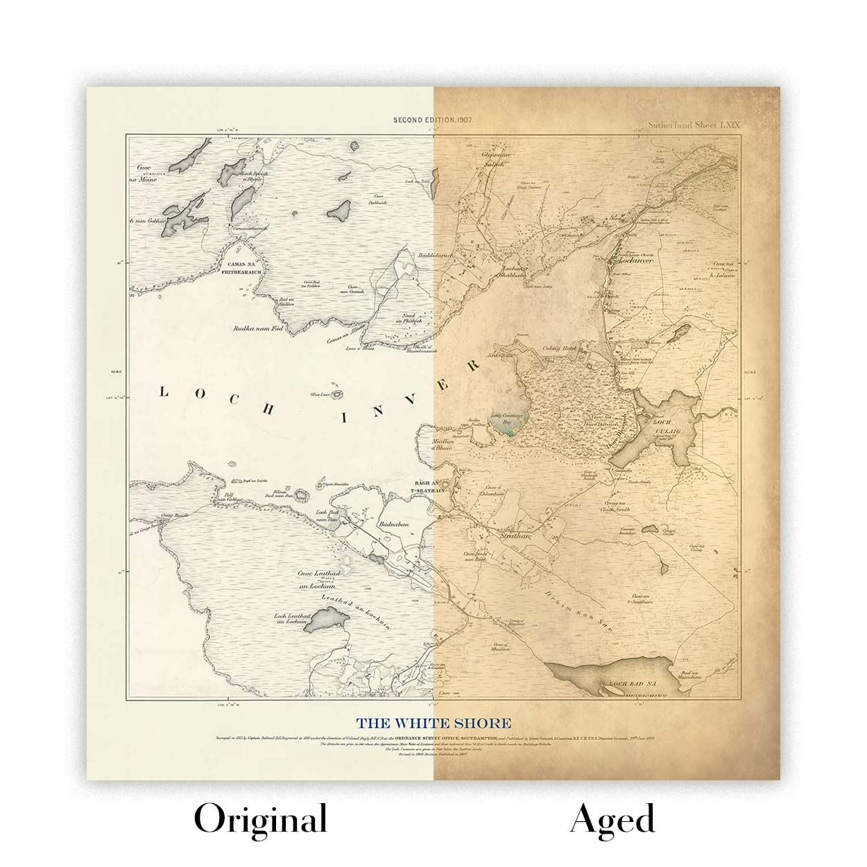
Kartenalterung
Im Laufe der Jahre wurde ich von Kunden hunderte Male gefragt, ob sie eine Karte kaufen könnten, die noch älter.
Nun, jetzt können Sie das, indem Sie „Alter“ auswählen, bevor Sie eine Karte in Ihren Warenkorb legen.
Alle Produktfotos, die Sie auf dieser Seite sehen, zeigen die Karte in ihrer Originalform. So sieht die Karte heute aus.
Wenn Sie „Gealtert“ auswählen, werde ich Ihre Karte von Hand altern lassen. Dazu verwende ich ein spezielles und einzigartiges Verfahren, das ich durch jahrelanges Studium alter Karten und Gespräche mit Forschern zum Verständnis der Chemie alternder Papiere entwickelt habe, und natürlich ... viel Übung!
Wenn Sie sich nicht sicher sind, bleiben Sie bei der Originalfarbe der Karte. Wenn Sie etwas Dunkleres und älter Wenn Sie auf der Suche sind, entscheiden Sie sich für „Aged“.
Sehen Sie einige erstaunliche Beispiele für gealterte Karten.
Wenn Sie aus irgendeinem Grund mit Ihrer Bestellung nicht zufrieden sind, kontaktieren Sie mich für eine unkomplizierte Rückerstattung. Bitte sehen Sie sich unsere Rückgabe- und Rückerstattungsrichtlinien für weitere Informationen an.
Ich bin sehr zuversichtlich, dass Ihnen Ihre restaurierte Karte oder Kunstdruck gefallen wird. Ich mache das seit 1984. Ich bin ein 5-Sterne Etsy-Verkäufer. Ich habe Zehntausende von Karten und Kunstdrucken verkauft und habe über 5.000 echte 5-Sterne-Bewertungen.
Ich verwende einen einzigartigen Prozess, um Karten und Kunstwerke zu restaurieren, der extrem zeitaufwendig und arbeitsintensiv ist. Die Suche nach den Originalkarten und Illustrationen kann Monate dauern. Ich benutze modernste und unglaublich teure Technologie, um sie zu scannen und wiederherzustellen. Daher garantiere ich, dass meine Karten und Kunstdrucke eine Klasse für sich sind - deshalb kann ich eine unkomplizierte Rückerstattung anbieten.
Fast alle meine Karten und Kunstdrucke sehen in großen Größen (200 cm, 6,5 Fuß+) erstaunlich aus und ich kann sie Ihnen auch gerahmt und über einen speziellen Übergrößen-Kurier liefern. Kontaktieren Sie mich, um Ihre speziellen Bedürfnisse zu besprechen.
Or try searching for something!


